

|
|
Sunrise to Sunset |
|
While working as an academic at the University of Natal (now KwaZulu-Natal), I was afforded the privilege of two six month sabbaticals, one in Melbourne (Australia - Jan to June 1992), and the other in Auckland (New Zealand - Jan to June 2000). Both were wonderful experiences of friendly people and great cities. But, in each instance, I missed the big blue dome that I live under in PMB, especially as winter approached. In both of these cities, the sky gradually turned from blue to grey, and the cloud cover dropped to head height, or so it seemed. Returning home was of course also always great, and made even better when I looked up and the big blue dome was still there, just as it was when I left it.
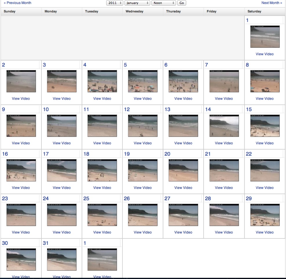
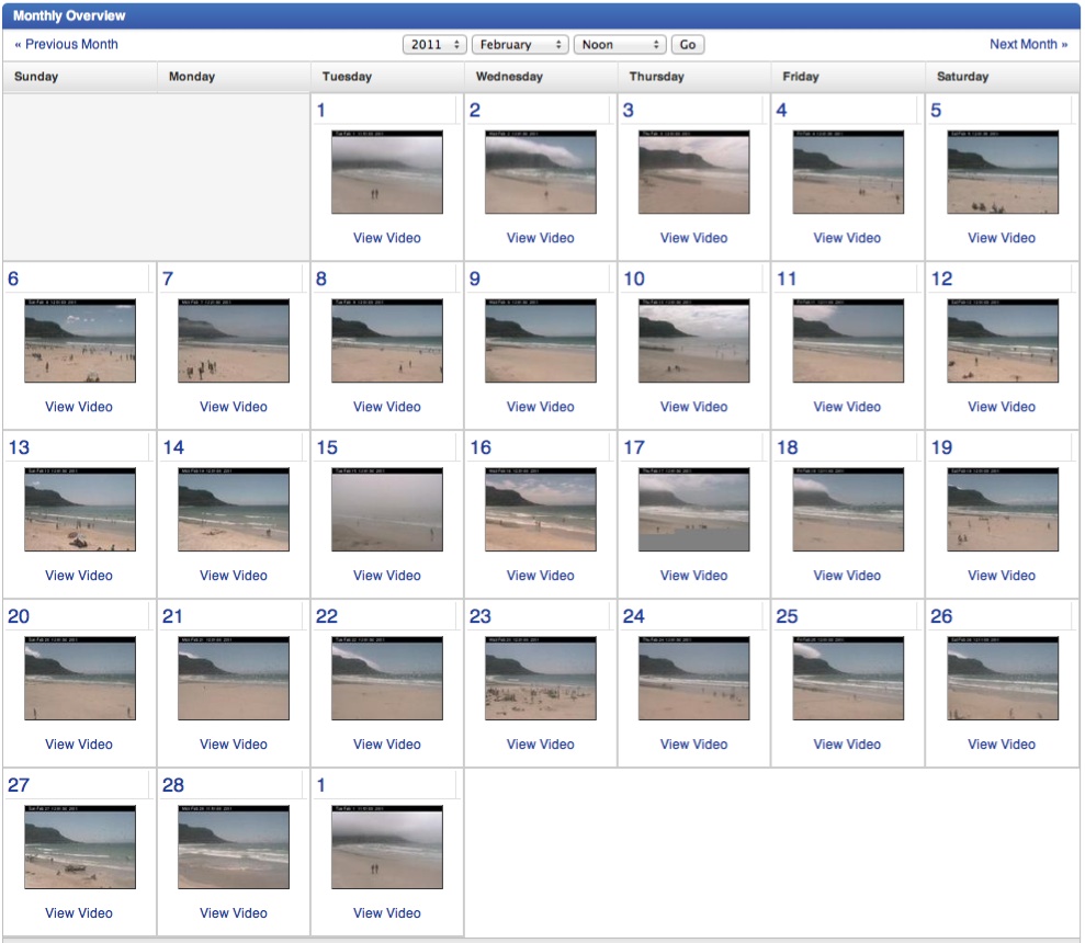
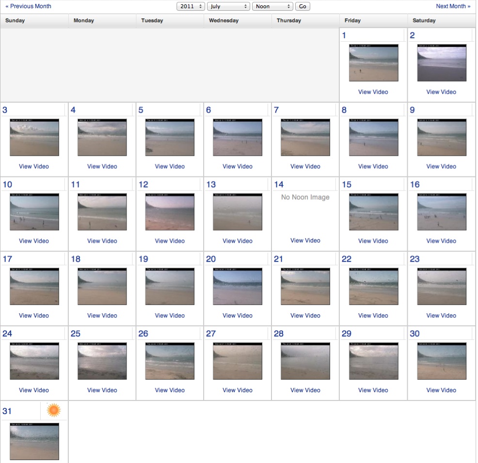
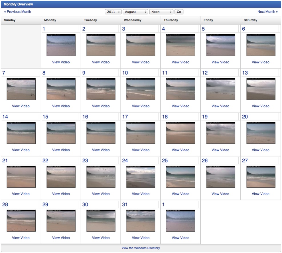
| PMB | January | February | July | August |
| Perth | January | February | July | August |
| Cape Town | January | February | July | August |
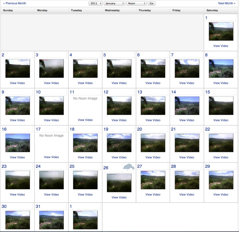
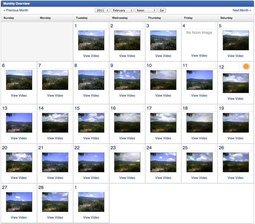
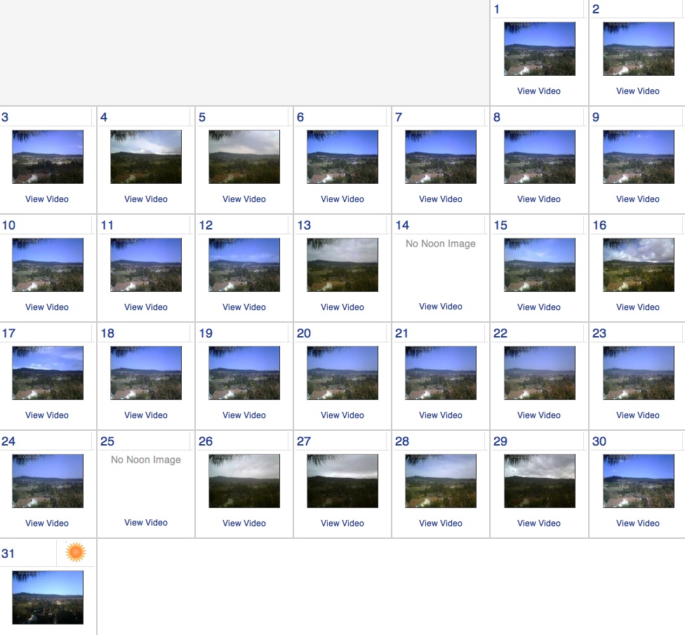
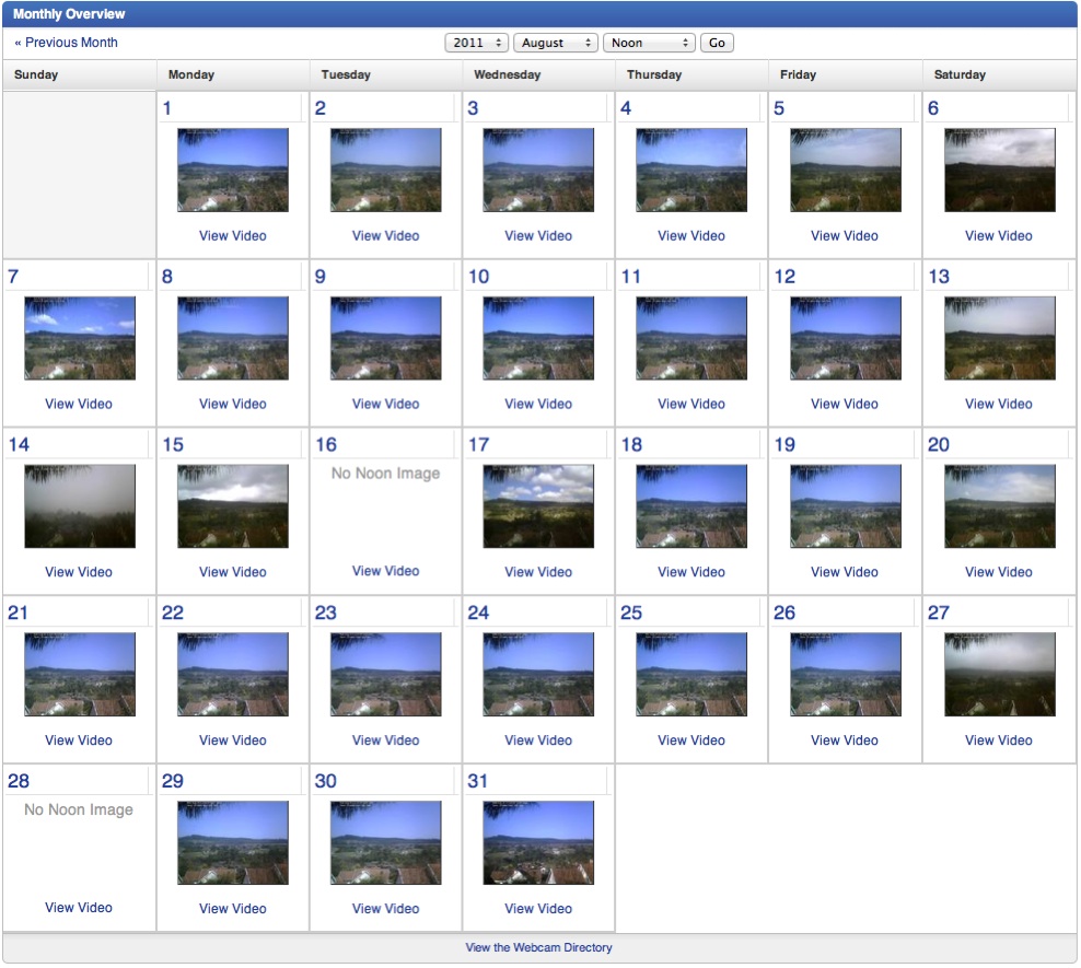
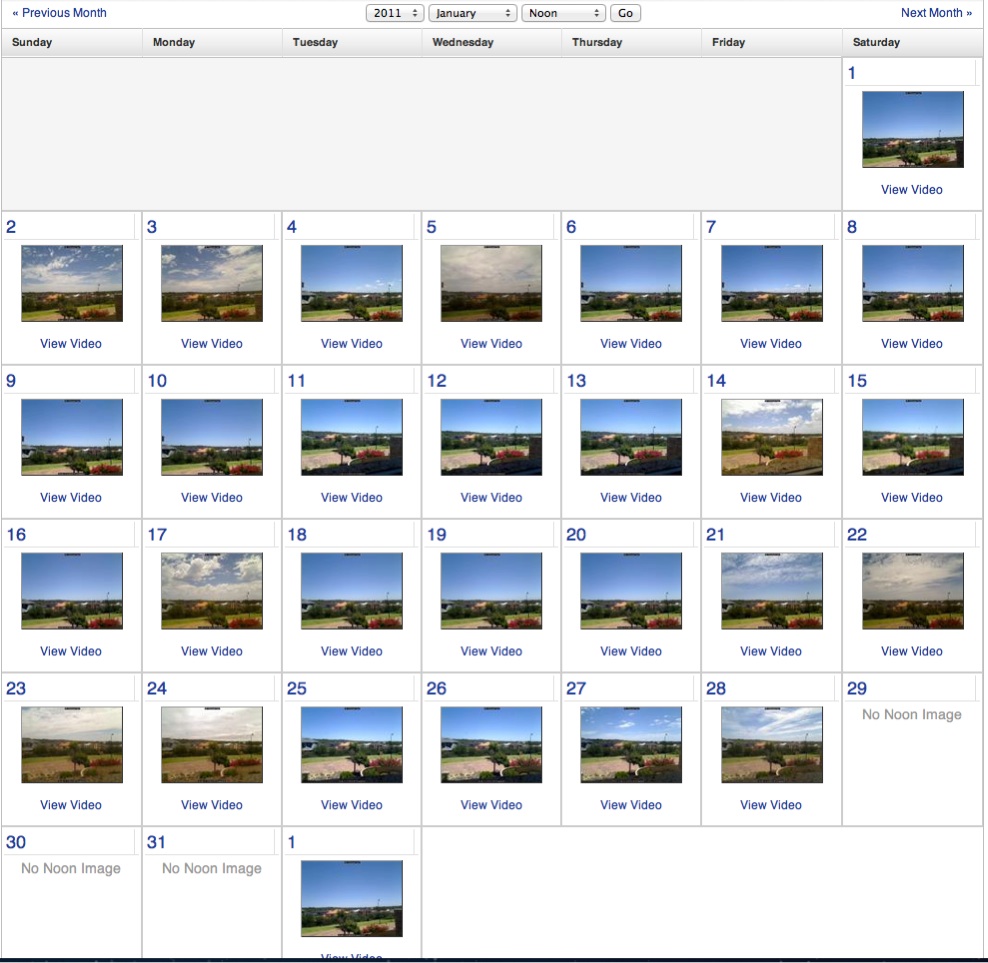
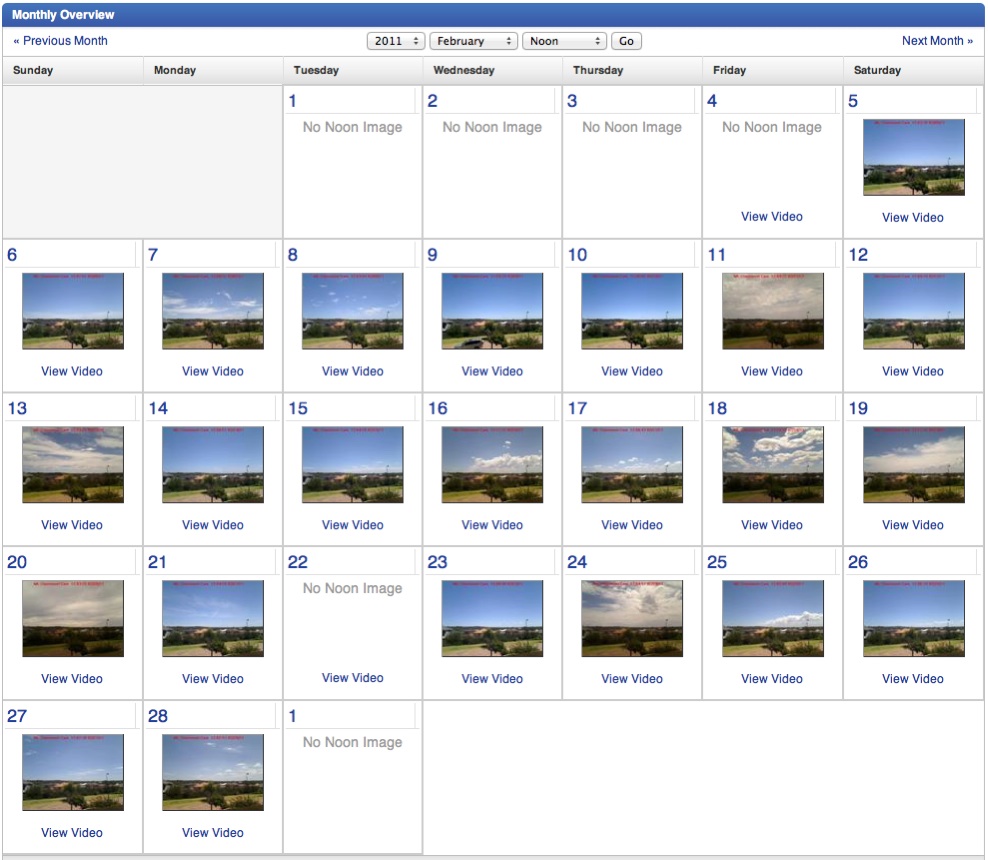
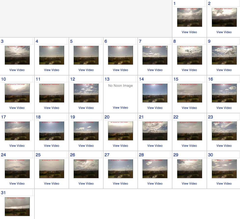
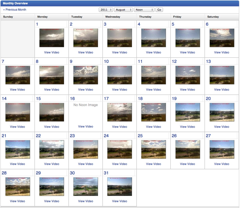
The above comparison is of course unfair, as it only represents two months. It also compares a Mediterranean climate (Perth?), with one that is difficult to label (PMB). The reason behind why I came to make the comparison, had more to do with the webcam we have in PMB, that features on the Weather Underground forecast page for PMB ). I check this page each day to ensure that the webcam images are being uploaded properly i.e., there isn't a fly sitting on the webcam lens. Doing this lead to me to also looking at the corresponding page for Perth each day, and ultimately comparing the monthly displays for the two cities. To see a monthly display, click the corresponding displayed webcam image in either pf these two pages. You may also want to play the sequence of images as a video clip.
Making the comparison, and subsequently others, has satisfied a curiosity I had for some time regarding the amount of sunshine Londoners and Durbanites experienced, as I had once heard that is was not that different. I have now established that on average London gets 4 hours while Durban, 6 hours. Taking it further, I was at first surprised to find out that Cape Town, got 8 hours. But I then thought about it, and it made sense as Cape Town enjoys long mostly cloudless summer days, and short mostly cloudy winter days. When you compare the monthly images for Cape Town in summer, with those for winter, you would be forgiven for thinking that everyone had left Cape Town and gone back to Gauteng (or the UK / Germany), for the winter (summer). If you think I am wrong, please let me know.
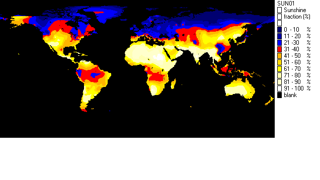
If you are intrigued by all this, you may also be interested in the following animated GIF that I came across. It displays the sun shine world wide month by month for a year. Unfortunately I lost the URL of the site from which I lifted the animated gift (which was created in 2011), and so am unable to acknowledge the work which was done.
[added 13 March 2017] Prompted by the cancellation of the Cape Town Cycle Tour (35000 entrants) due to extremely strong wind conditions, I took another look at the sunshine issue. Using data from the Holiday Weather site, here is another comaprison of sunshine hours for cities that I thought made for interesting comparisons within my own living / travelling experiences
| City | Average Hours of Sunlight per day |
| Durban, South Africa | 7.25 |
| Cape Town, South Africa | 8.08 |
| Perth, Western Australia | 9.50 |
| London, United Kingdom | 4.00 |
| Edinburgh, United Kingdom | 5.17 |
| Cork, Ireland | 2.83 |
| Frankfurt Am Main | 4.25 |
I first put up this page up during March 2011. Today, Saturday 09 November 2013, I was surprised to receive an email from a student I met whilst lecturing Computer Science at the University of KwaZulu-Natal. He has not only managed to locate a URL reference [***link is broken***] (scroll to the end) for the animated GIF mentioned above, but has also managed to find a reference to the original publication. Much appreciated Emmanuel!
The new page for the GIF is better as it includes a second GIF that shows the sunshine experienced by Australia and New Zealand during a calendar year. It is also particularly relevant to this page as it makes it much easier to compare Melbourne and Auckland, and clearly shows the nature of Winter in these parts. Very different from what I experience here in Pietermaritzburg.
My interest in the comparison of the amounts of sunshine experienced by Pietermaritzburg, and other centers, was initiated by the calendar view of the noon webcam images as displayed for cities by the Weather Underground. More recently, the presentation for the calendar view of the noon webcam images for the PICPMB webcam, has images missing. This development motivated me develop my own version of the calendar view of the noon webcam images for the PICPMB webcam. It presents a running 35-day month and can be viewed here.
|
|
[email protected] |
|
|
Google+ | www.robdempster.com |
|